@Ga_Melbourne by Johan Codinha.
 Adventure time Thursday.
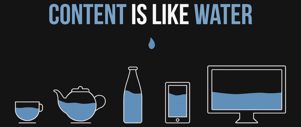
Today we talked about responsive design and how it simplify our life as designer and programmer. How ? By having one design that will adapt to the width of the user’s screen and will reorganize elements to fit the page. But let’s not forget that users browsing your site on mobile will look for different information and services than users browsing on a desktop. For example, if I’m checking out a restaurant website from my mobile, the first things I want to see are opening time, address and a phone number. Now if I’m browsing on a desktop I’m looking for a more visual experience, an overview of the vibes the place as to offer. So it’s not enough to squeeze everything into a single column because different browsing devices introduce different users expectations.
 Every day goals :
Coding, I spend the day in an infinite loop containing a coding() and a changeBrowserWidth() function, seriously who does that IRL.
Talking about it, This one is more an audio memo but I made it so I post it. 8th Walk and Talk.
 TIL :
TIL :
-
Grid adventure, how to convert pixel based design to responsive with a simple formula:
content / context = %. - @media queries, is the foundation of responsive design. Check out mediaqueri.es for some inspiration.
-
DOM,
addEventListener('DOMcontentLoaded', function() {}in case you need to wait for the DOM to load before you start modifiing it.
 Quotes of the day :
“The power of the Web is in its universality. Access by everyone regardless of disability is an essential aspect.” - Tim Berners-Lee